
28% less data traffic on mobiles
We do more and more on our mobiles: browsing, facebooking, snapping, booking, ordering, banking and much more! To ensure that all Citynavigator websites have an ultimate mobile User Experience, we are constantly optimising our platform. Previously, we applied Lazy loading for images, which has already greatly reduced data usage on mobile devices. Now we are going even further! We display smaller images on mobile devices than on, for example, a laptop with a fixed internet connection. We call this principle responsive images.
Responsive images: don't give me more than I can handle!
Whereas our websites previously displayed a "golden section" (a crop of an image in a format that best suits the pagepart), we are now introducing responsive images. With this extension, while the image is loading, we check which image format fits best. This depends on screen width and screen quality, among other things. Whereas on desktop (large screens) we often need large images, this is not always the case for mobile. Mobile phones simply have a smaller screen and can therefore be served smaller images. This has a big advantage for the user: the difference in quality is almost invisible, but downloading the image is much faster and costs less data.
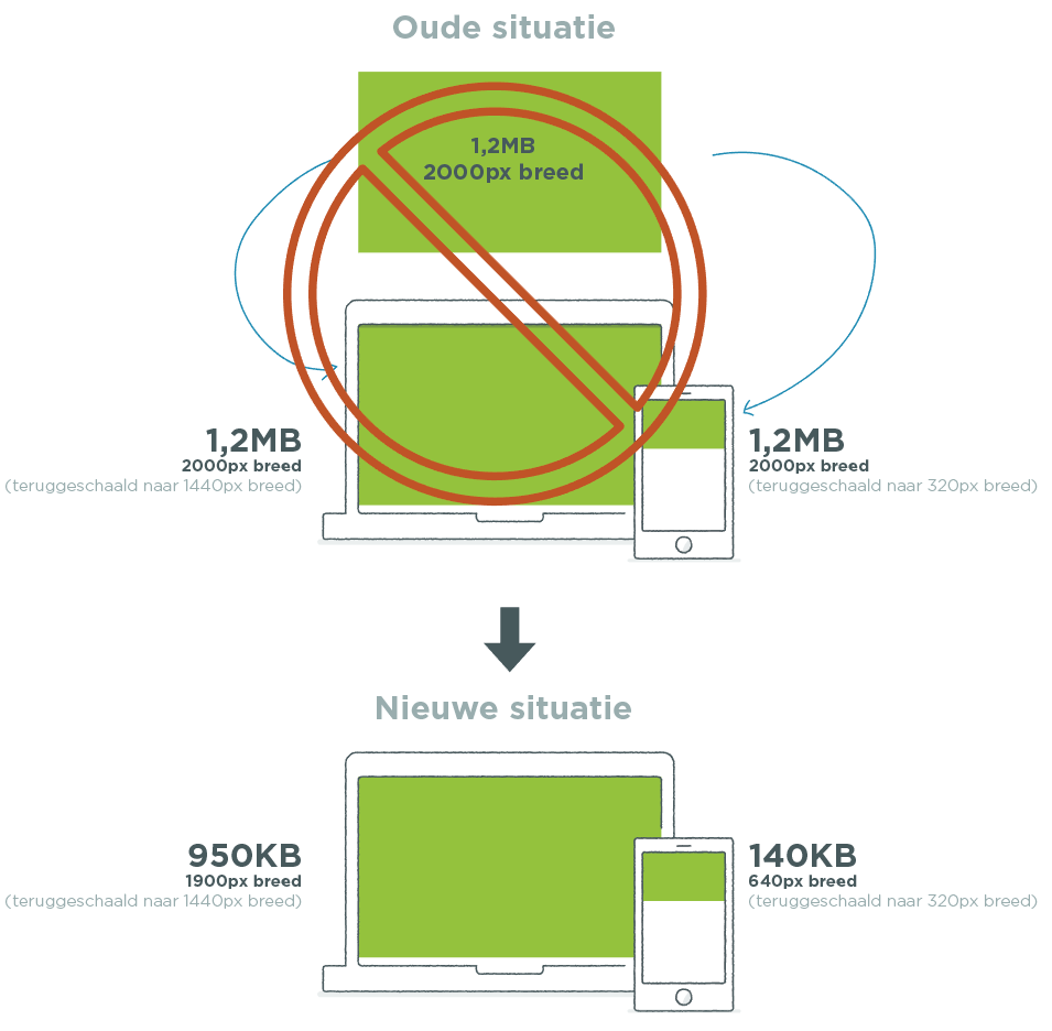
Image: old and new situation
With the application of responsive images, a number of things have changed compared to the previous situation:
- No more image cropping.
- New (standard) image formats have been set up, allowing every situation to be served the right image.
- For each width, we look at which format image can best be loaded.
- All pageparts now have correct focal point operation
- Search Engine Optimisation: better findability and indexing of images in search engines (Google, Bing)
What does it deliver?
In the first internal benchmarks, we see the following results:
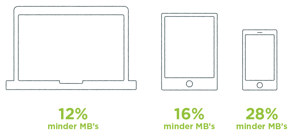
In the example above, we see that on a smartphone (on average) 28% fewer MBs are downloaded. In practice, we do not look at the type of device, but at the space an image takes up on the screen.
Load the right image per width
We look (on any device) at the width the image occupies on the screen. If an image is displayed on the full width of the screen, a larger image should be used than if an image is used in a 3-column layout.
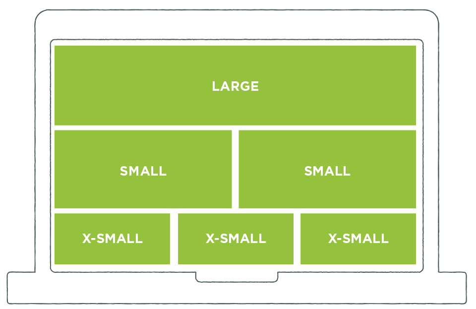
Example of intelligent image sizing
We have determined which image to use per page part and screen layout. These settings are set for all Plaece installations. They may differ per customer installation. Account has been taken of the file size in combination with the quality of the front image. The images are set so sharp that the user does not suffer any loss of quality! In other words: sharp images stay sharp.
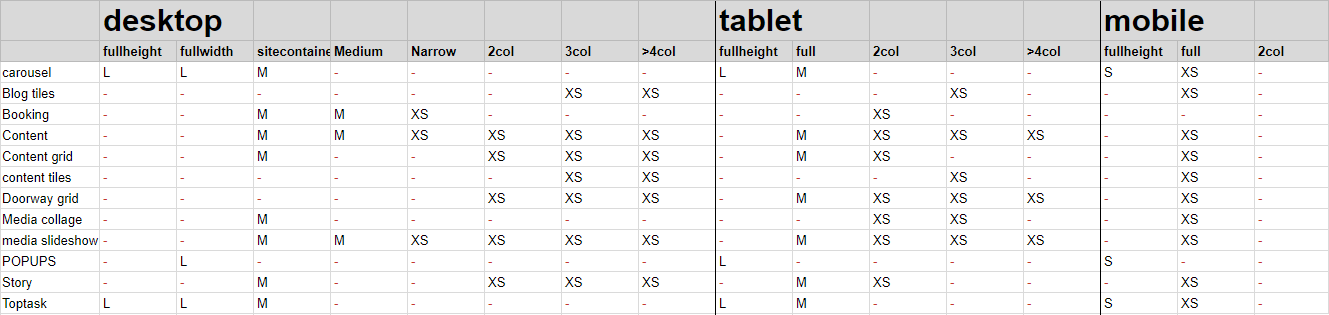
Image size per device/screen share
Merged croppings and new image formats

Where previously each pagepart had its own cut-out of an image, this is now merged into a universal format. This results in much less storage space on the server; in some cases, storage is even halved. One parent image is always assumed. The moment the image is used in a specific pagepart and viewed on the website, the image will actually be newly created. Thus, the images are created and stored "on-demand", so that they are immediately ready for use next time. Through smart caching, the images are immediately ready for other users to view.
Focal point optimisations

Earlier, we added functionality to always show the most important part of the photo in the image: the focal point. The focal point was already available in all pageparts, but in some pageparts it still did not work optimally when placing exceptionally high or wide images with a focal point in one of the corners. This problem has now been solved and the focal point now also works optimally for the Content Tiles pagepart, the Media Collage pagepart and the Media Slideshow pagepart, among others.
Search engine optimisation
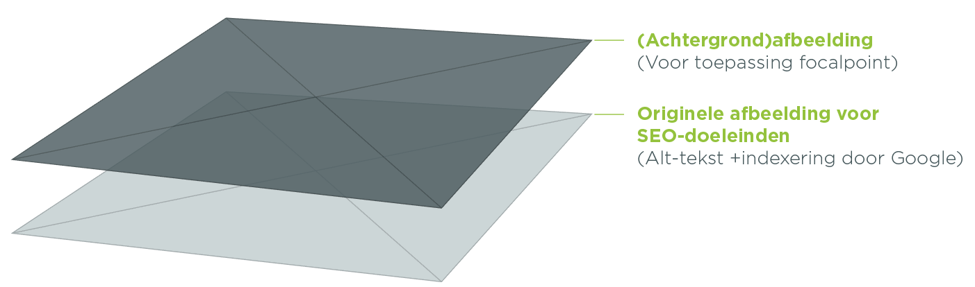
Optimisations have been made in various page parts to improve indexing of the images by search engines. The description of the image, which can be entered with the image in the media bank, is included in the code. If a good description is filled, explaining what can be seen in the image, the page and image will be more findable. Two images are set in the code. The first image is used by Google (and other search engines) to index and give context to the page. This image is hidden from the visitor. The second image is loaded over it as a background image, making it possible to determine the focal point. The image is thus downloaded only once, saving a lot of data! The advantage of this method is that Google can simply index the image, but we can also determine the focal point.
Coming soon!
In the next major update, responsive images will be available automatically. Ask your contact person when the next update is scheduled.
What do you think of these improvements? Or do you have any questions or suggestions? Let us know via info@plaece.nl/en